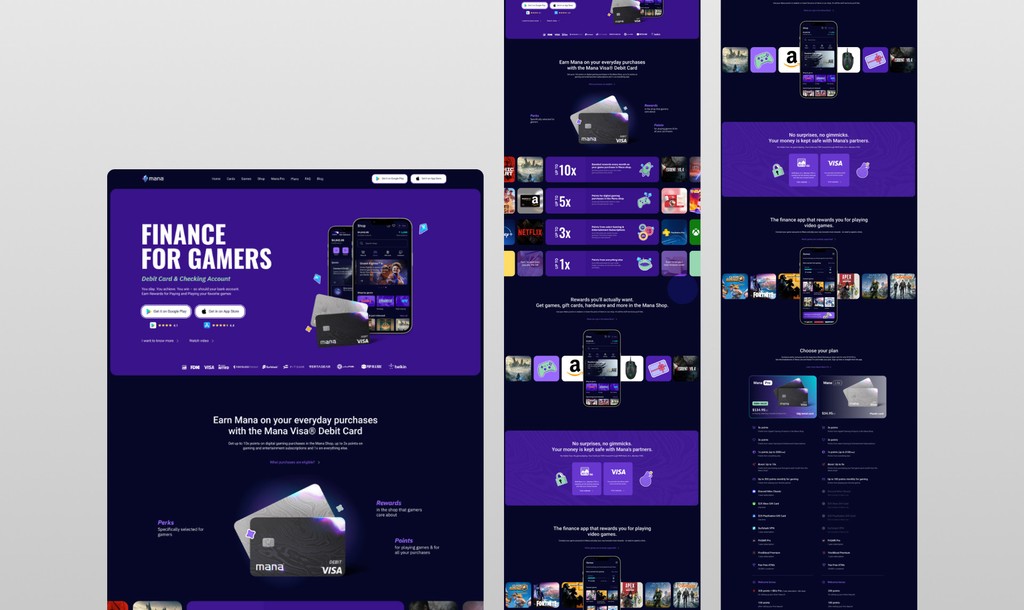
Mana
A fintech mobile app built for gamers. A debit card with daily-spending points, exclusive gaming perks, quests and financial tracking wrapped in a gaming-inspired UI. Banking that actually respects how its users live.

Banking didn't know gamers existed
Traditional banking apps treat a $9.99 game subscription and a $2,000 rent payment the same way: a line in a list. For gamers whose income often comes from streaming and prize pools, and whose spending is spread across dozens of micro-transactions, the default banking experience surfaces nothing useful at all.
Mana was founded to fix that. The opportunity was not to build yet another neobank. It was to build the first financial product that actually understood its user's world and spoke their language while doing all the boring banking stuff correctly behind the scenes.

Make a banking app that doesn't feel like one
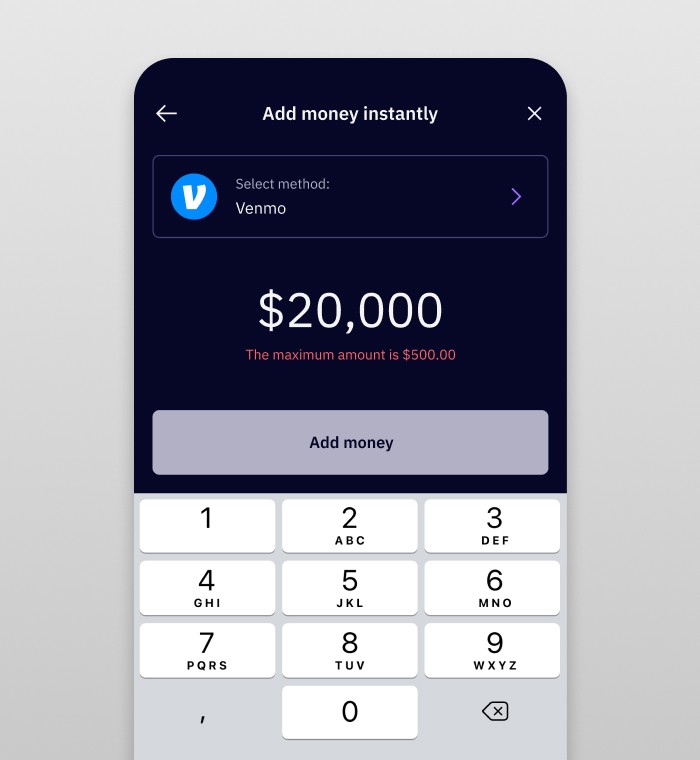
The app needed to feel intuitive for young gamers while handling the full complexity of real checking-account functionality. Transfers, card management, subscriptions, address verification, external bank linking. All of it. And it had to look the part too, with a visual style that fit the gaming aesthetic without sacrificing credibility as an actual financial tool.
That balance was the hardest part. Playful without being cheap. Serious without being sterile. Every screen went through multiple rounds of testing with real users because my gut instinct on where that line falls was not always right.
Mobile-first, tested with real gamers
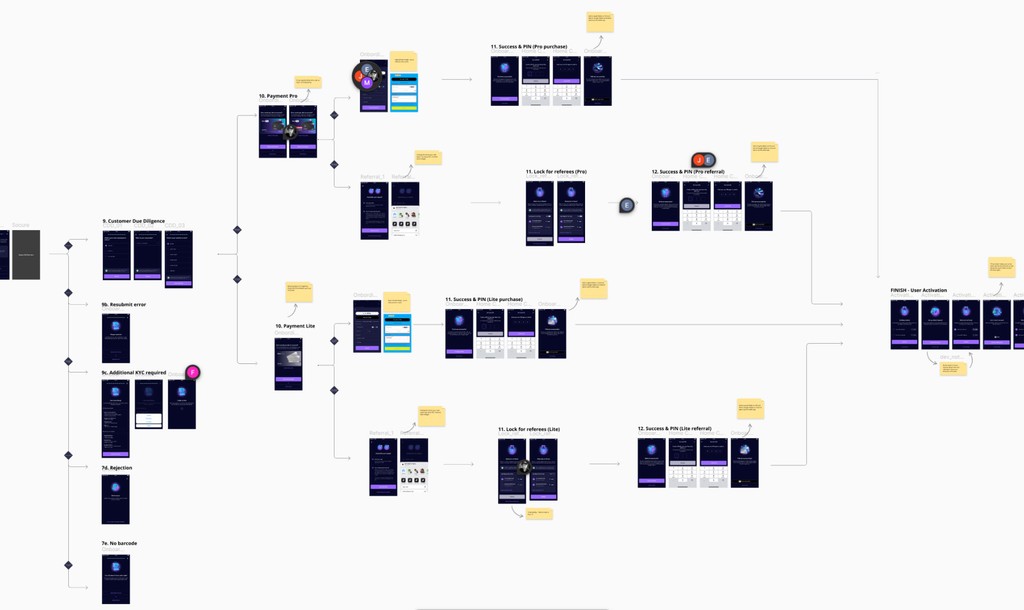
User-tested at every step. I ran one-on-one tests using clickable Figma prototypes with two distinct audiences: gamers opening their first checking account, and active users who had been in the beta. Feedback drove direct simplifications in how spending tracking worked and how rewards surfaced in the interface. The screens you see in this case study are the result of multiple tight iteration loops, not first drafts.
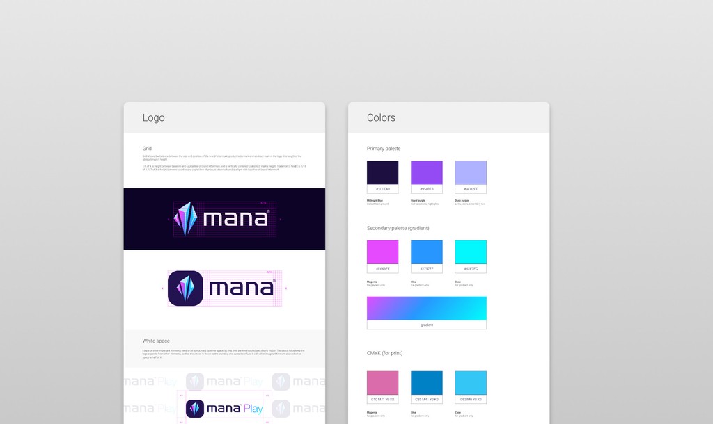
One design system, every surface. I built the Figma design system from the first week so that card designs, quest layouts, perk cards and banking primitives all spoke the same visual language from the start. That early investment paid off quickly. The junior UX/UI designer I onboarded could ship confidently from day one, and the marketing designer I mentored could produce brand materials that looked like they came straight out of the app.
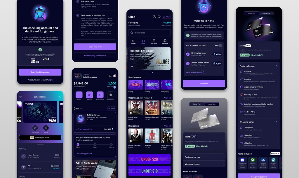
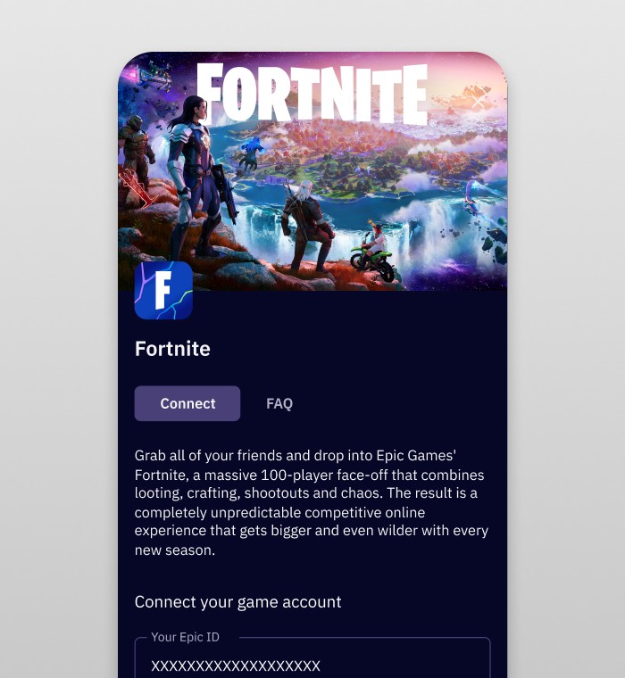
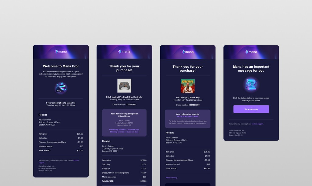
Cards with personality, quests as a first-class feature
Earning is a verb in Mana, not a bolt-on promotion banner. Daily-spending points, connected-account rewards, referral quests and limited-time perks all live on the home surface because that is where a gamer expects progression to live. The home screen borrows its mental model from a game lobby, not a bank statement.
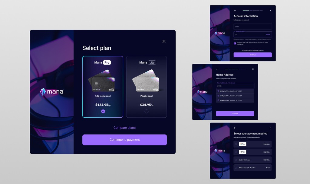
Plan selection feels less like picking a pricing tier and more like choosing a character class. Same mental model, same confidence in the decision. Users told us in testing that the card selection screen was the moment they knew this was not just another banking app with a fresh coat of paint.
Banking, but not boring
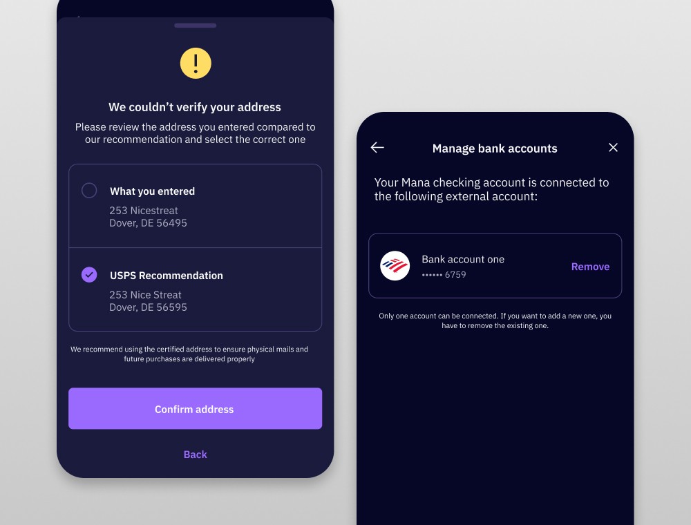
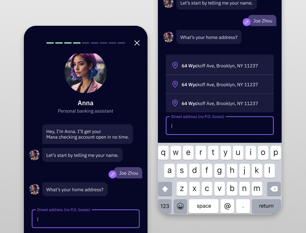
Address verification, connected bank accounts, transfer limits, identity checks. All of these had to exist because regulators require them, and all of them had to feel native to a gaming-first product. I designed the banking screens to stay clean, dark-themed and low-stress so that a 19-year-old verifying their ID does not feel like they have been teleported into a 1990s bank branch.
The trick was treating compliance flows as a design challenge rather than a necessary evil. When you respect those screens enough to design them well, users actually complete them instead of dropping off halfway through.
AI onboarding & a VR MVP
Two parallel explorations pushed the product further. I prototyped a VR app for Meta Quest as an MVP that actually reached the development stage. The goal was to give the Mana community a shared, game-like virtual space tied to the brand identity. Separately, I started designing an AI-powered onboarding flow to replace the traditional stack of legal forms with a conversational assistant that could guide new users through disclosures in plain, human language.
Neither of these shipped to a wide audience, but both proved that the design system and brand language were flexible enough to stretch into completely new formats without breaking.
Shipped, loved, and honest about the ending
Mana shipped to an engaged beta community that treated onboarding like a weekly product drop rather than a chore. The quest system drove meaningful completion rates on financial actions that banking apps usually struggle with, like identity verification, savings goals and external account linking.
The product ultimately wound down. The cost of replacing its banking partner exceeded what the app could sustain financially. That is a real fintech outcome and I think it is worth sharing honestly rather than pretending every project ends in a hockey stick graph.
The design learnings stayed with me though. How to make gamified finance feel genuine instead of gimmicky. How to test with your actual audience instead of guessing. How to build design systems that work for a growing team, not just for the person who made them. Those lessons show up in everything I have designed since.