A trading app that feels like a feed, not a terminal
Based lets you take a position on whether a cultural trend is “based” or “cringe”. Underneath there is an automated market maker, perpetual-style positions, a token economy and on-chain settlement. On the surface there is a feed, a swipe and a score. My job was to keep it that way.
 Jimi LehtonenCEO and founder, Based · on LinkedIn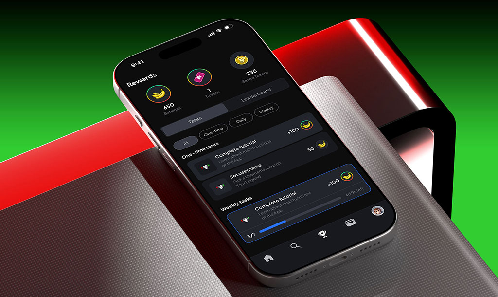
Two founders with a direct pitch: take the infinite scroll of TikTok, combine it with trading primitives, and let people bet on culture. They had the engine. They needed the product people would open five times a day, and they brought me in with full ownership of product, brand and motion.
Most consumer crypto apps lose the user in the first minute, because the machinery leaks into the main surface: wallets, gas, slippage, contract calls. Based had to feel like an arcade game to someone opening it cold from a friend’s invite link, while being, technically, a trading platform.
Collapsed the whole experience into three verbs, made the game layer the retention layer instead of bolting one on, and gave the app a visual identity loud enough to win a moment in the same feeds it competes with. I prototyped a dozen versions of the core interaction before one felt fast enough.
Ten days into the open testnet in February 2026: 47% of cold invites became active accounts, 33% of those were still trading a week later, and active traders came back four to six times a week. Testnet numbers, not mainnet; I say more about that below.
A consumer wrapper on a financial engine
The mandate from the founders was short: we need to frontrun culture. My job was to work out what that looks like as a product. Not a trading terminal with a nicer skin, and not a social app with a token stapled to it, but something where the trading is the fun and the fun is the trading.
I came in as Head of Design, part-time, with the product, the brand and the motion language all mine to define. The engineering team built the market maker and the settlement layer. I never touched those, and the whole design job was making sure the user never has to either.
Crypto UX that doesn’t feel like crypto
Every piece of financial machinery in the app had to be present, had to be correct, and had to be invisible until the moment someone actually needed it. That is a discipline of hiding. It is also a discipline of not lying: the position is real, the settlement is real, and when a user wants to see the numbers behind a trade they are one tap away, just never in the way.
The tension between “this is a trading platform” and “this feels like scrolling TikTok” drove every decision that follows.
Three verbs: scroll, trade, watch it resolve
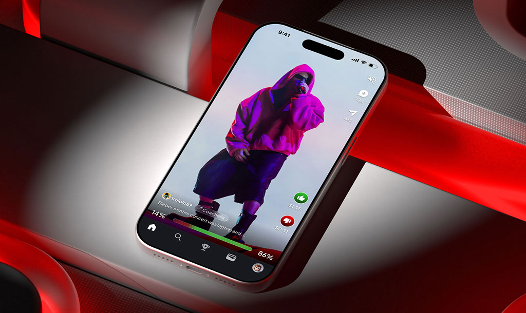
The obvious shape for a trading product is the one every exchange has: order types, order books, a confirmation modal, a chart. I threw all of it out of the main loop. You scroll a full-screen feed. You tap Based or Cringe to take a position. You watch the sentiment bar move and the result resolve. No order book, no jargon, one thumb and one opinion.
The cost is that a power user cannot express a complex order from the feed. That was the right trade: the people we needed to win were not power users, and anyone who wants the detail has it on the trade screen. It took weeks of prototyping to strip the loop down until it felt effortless, and I went through more than a dozen interaction patterns before landing on this one.
the feed
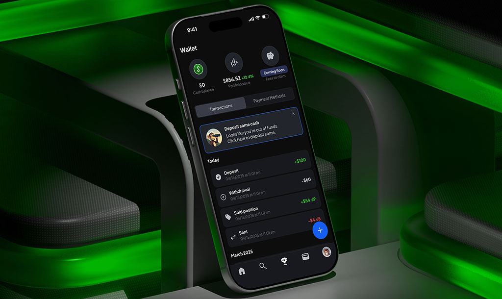
the trade screen
The real numbers, for whoever wants them. Never in the feed.
the engine
Real, correct, and running under every tap. The engineering team built it; the design job was keeping it out of sight.
The game layer is the product, not a promotion
A crypto app normally reaches for APY dashboards, staking flows and airdrop quests to keep people around. I did not want any of that on the surface. Instead the retention mechanics are game mechanics: daily spins on the Wheel of Based, status tiers that escalate, the Based Banana Cartel for the whales. They are not bolted on. They are the loyalty structure.
The risk with gamification is that it reads as cheap. The way I managed that was to make the game layer the primary structure rather than a decoration on top of a serious app, so it never looks like a serious app pretending to be fun.
A brand that has to win inside other people’s feeds
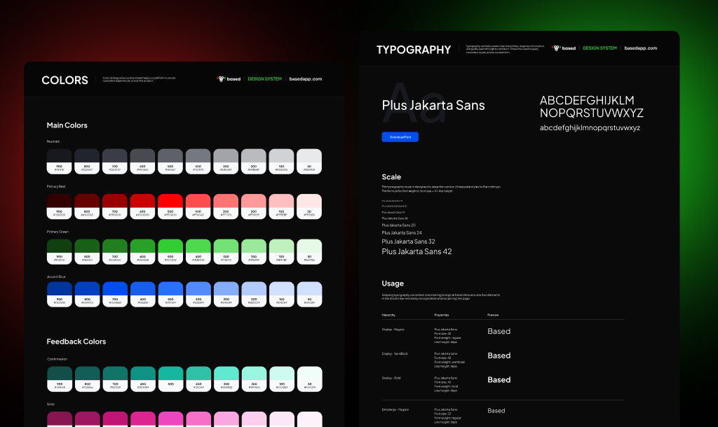
Based competes for attention in the same feeds its content comes from, so the identity had to earn a stop. High contrast, neon accents on deep black, type with some personality, microcopy written the way the users actually talk. And then the harder part: every surface, from the profile to the settlement modal, inheriting the same voice, so a product that was weeks old felt like it had been around for years.
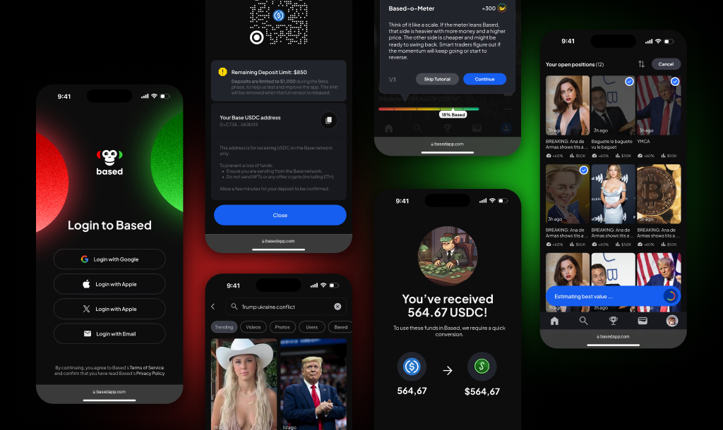
Every screen, one system
Login, deposit, onboarding, explore, open positions. Every surface uses the same language, which is what lets a new user feel oriented in the first session instead of the first week.
Ten days of testnet, and what the numbers do and don’t say
These are from the open testnet in February 2026, ten days in. They are real, and they are early. Testnet users skew towards people who already wanted this to work. I would not promise the same curve on mainnet, and neither should anyone reading this.
Both the conversion and the retention came from the same decision: hide the machinery completely and give people a scroll-and-tap surface that feels like the phone they already use. The company had raised its $420K pre-seed in January 2025, before I joined; the testnet is what the product looked like a year later. In 2026 Based rebranded to Ratio.
What I would want next
Mainnet data, first of all. The testnet told me the loop works for people who were already curious; it cannot tell me what happens with real money and a colder audience. The second thing is the game layer under load: tiers and wheels are easy to love in week one and easy to resent in month three, and I would want to watch that curve closely before adding a single new mechanic.
- Mine
- Product design, the core loop, onboarding, brand identity, motion, the design system
- Founders
- The thesis, the token economy, the mandate
- Engineering
- The market maker, settlement and the apps themselves