A design system for a regulated product, adopted one screen at a time
Chemius is compliance software for people who write safety and technical documentation for chemicals. Its interface had grown into a patchwork of PrimeNG defaults. I designed a token-based system in Figma and shipped it as production Angular, with AI writing most of the code and me holding the line on how it should feel.
 Bojan BuinacCEO and founder, BENS Consulting · on LinkedIn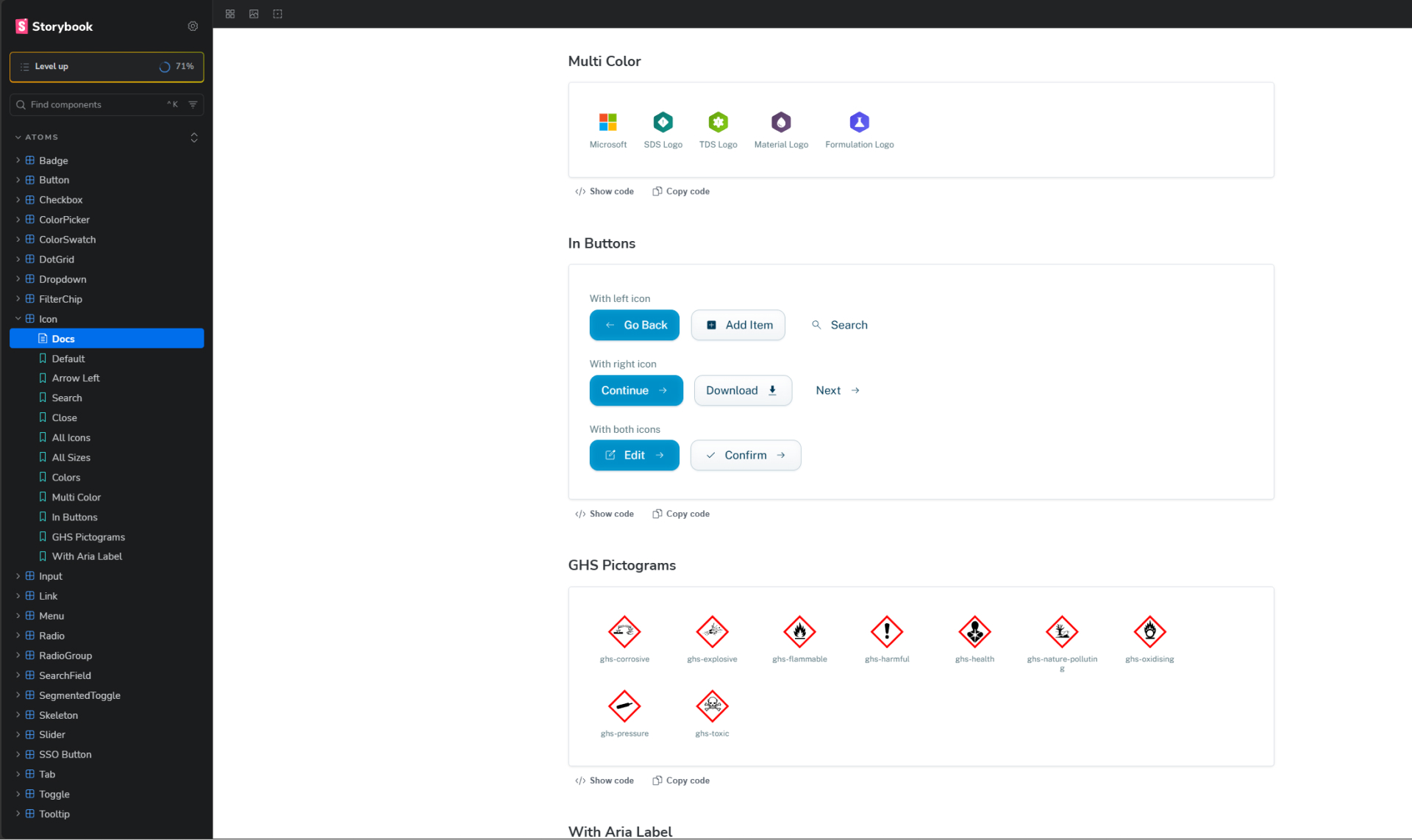
Chemius handles safety data sheets, technical data sheets, labels and legislation tracking. A wrong field on screen becomes a wrong field on a regulated document, so the interface has to stay calm and exact. It did not. Spacing, colours and components varied from screen to screen, and every release lost time fighting the UI.
The team had two options they did not like: keep patching the PrimeNG theme, which is how it got this way, or stop and rewrite the front end, which a small team shipping a regulated product cannot afford to do.
Built them a system of their own. Tokens first, then components, then a theming layer that lets four regulatory domains share one library, then a migration guide so the old and new UI could coexist while screens moved over one at a time.
In use. The team migrates off PrimeNG screen by screen. There is no usage metric yet that I would put my name to; the numbers below are counts of what shipped, not results.
A regulated product running on borrowed parts
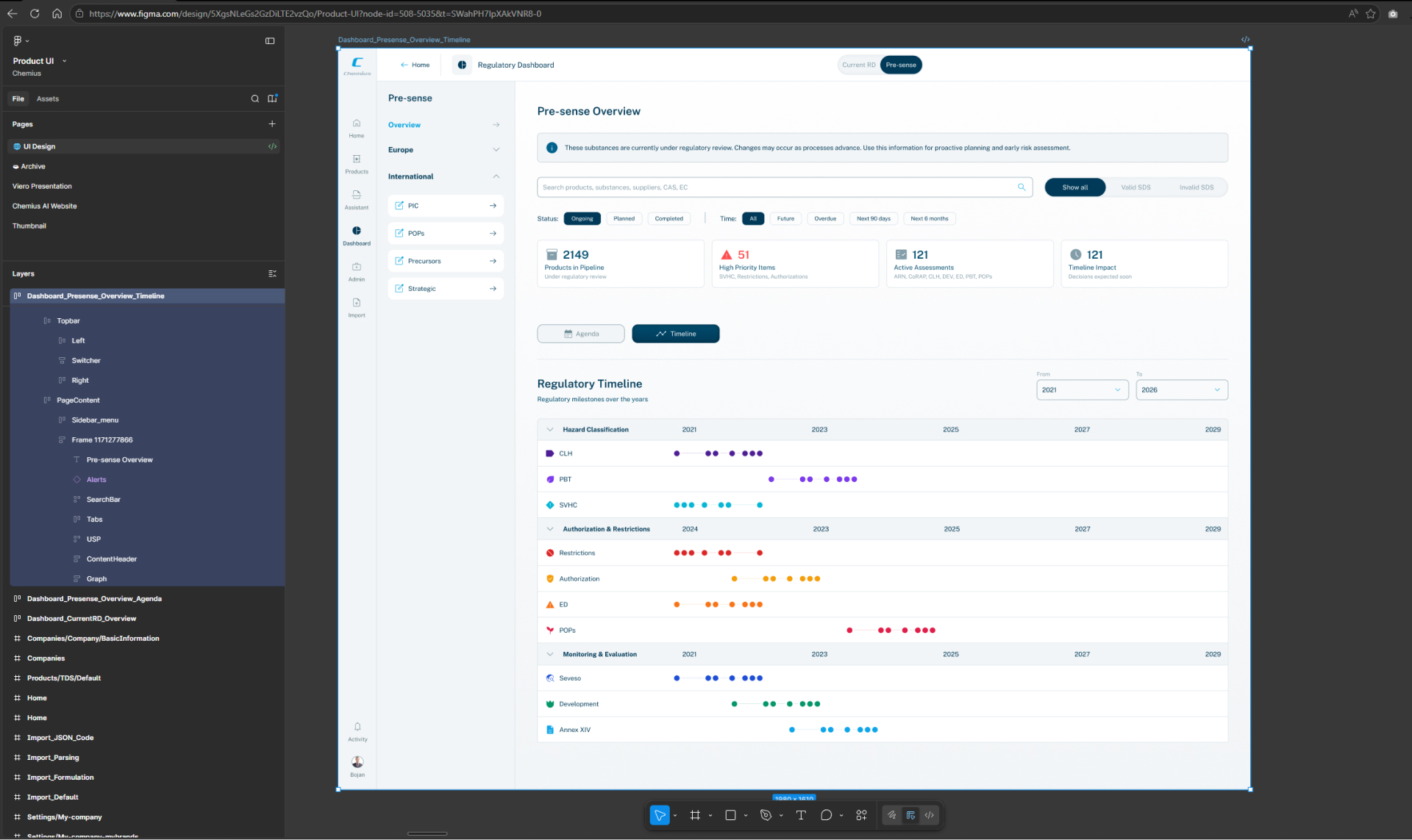
When I joined BENS Consulting to redesign Chemius, the plan was a new product surface. It quickly became clear that a new surface built on the same borrowed parts would drift the same way the old one had. The PrimeNG defaults were not wrong in themselves. They were just never decided. Nobody had said what a button in this product is, how dense a table should be, what a warning looks like when it sits next to a hazard pictogram.
So instead of patching it again, I made the case for foundations. A few weeks of token and component work up front, in exchange for every screen after that being cheaper to build and impossible to get inconsistent.
Figma for the decisions, AI for the code, me for the judgement
The method was the same for every component. Map the domain and the flows. Design every primitive and every state in Figma. Then direct Claude Code to implement it as Angular and Storybook, under rules I wrote, and review what came back. I did not type most of the code. I did decide all of it.
Domain and flow mapping, the token architecture, every design and motion call, the accessibility bar, the documentation, and the final say on whether a component felt right.
Wrote the Angular and Storybook code, scaffolded every variant and state, and did the repetitive implementation, fast, within the rules I set.
Tokens before components
The obvious move was to start drawing components, because that is what the team was asking for. I started with tokens instead: ten colour families on a full 50 to 950 ramp, a 4px spacing grid, eight type sizes, three easings and seven durations. Every value is mirrored in CSS and TypeScript and kept in sync by hand, so what the designer sees and what the runtime uses cannot drift.
The trade-off is that for the first couple of weeks nothing visible shipped. What it bought was that a brand change now moves through one token instead of fifty components, and that the theming work in the next section was possible at all.
Chemius blue as primary, a circuit green accent, a soft graphite neutral ramp, semantic success, warning and error, plus four domain palettes, all addressable as --color-{family}-{step}.
Spring is for selection only. Exits always run faster than entrances. Every animated component ships a reduced-motion fallback. Written down, so nobody has to remember.
10 families, 50 to 950
--color-{family}-{step}CSS custom propertiesTypeScript constantsthe same valuesKept in sync by hand. What the designer sees and what the runtime uses cannot drift.
The wrapper swaps the domain colour by context. A button stays one button; headers, badges, steppers and tables pick the domain up.
69 components, 44 Storybook stories, icons through a registry.
So a component refers to “danger” rather than to a red.
Four regulatory domains, one component library
Chemius has four content types: safety data sheets, technical data sheets, materials and formulations. Each needs to feel like its own place, because a user working on a formulation must not mistake it for a safety sheet. The easy answer is four forks of the library. The expensive answer, six months later, is four forks of the library.
Each domain owns a colour instead. SDS teal, TDS lime, materials purple, formulations indigo, applied through one theming wrapper. A button stays one button; it just knows which world it is in. Headers, badges, steppers and tables pick the context up, and there is nothing to keep in sync.
One table under every data-heavy screen
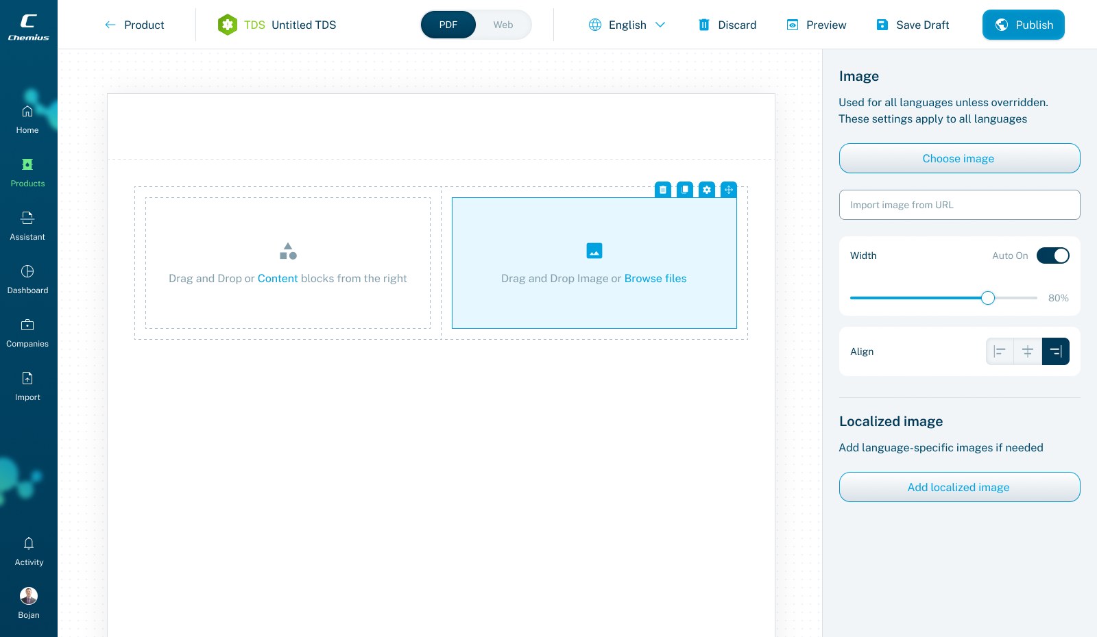
Most of this product is dense, regulated data, so the table is the heaviest thing in the system and the one that pays back most. I designed it once, with everything a materials list, an SDS register or a formulation grid would ever need, so that no screen has a reason to build its own.
- Sorting, column management and saved views
- Filtering, bulk actions and pagination
- Row expansion, instruction rows and total rows
- Empty, loading and error states
- URL-synced state and CSV and XLSX export
Alive, not bouncy
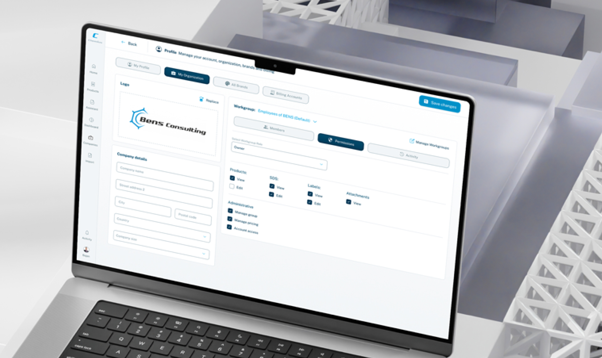
The references I kept coming back to were Linear, Vercel and Stripe. Spring for selection, expo-out for panels, exits faster than entrances, press states that actually move. Each decision is tiny. Together they are the difference between software that feels considered and software that feels thrown together, and on a tool people use eight hours a day that difference is not cosmetic.
What is in the library
Every component lives in Storybook, documented across every variant, size and state, so engineers see exactly what they are getting before they wire it in. The counts are from the repository at the time of writing.
- 69 components: 24 atoms, 11 molecules, a deep organism layer and 7 page templates
- 44 Storybook stories covering every state and variant
- Icon sets served through a registry, in tree-shakeable groups: core, editor, regulatory, brand
- 9 GHS pictograms plus the REACH, RoHS and SVHC regulatory marks
The floor, not a polish pass
For software used all day to produce legally binding documents, accessibility is not a nice-to-have. It is the minimum.
- Contrast documented per shade; every 950 clears AAA on white
- Saturated brand colours flagged as UI-only and barred from body text
- Full keyboard paths and correct ARIA on every component, in every state
- Reduced motion honoured across the whole system
Ship it without a rewrite
A design system that requires a big-bang rewrite is a design system that never ships. So this one comes with a migration guide off PrimeNG, a component and token reference, a theming guide and a pitfalls page. Old and new UI coexist. The team moves a screen when they touch it, and the product never stops.
The cost is a period where the product looks like two products. I would take that over a rewrite that stalls every time.
What shipped
One coherent library, in production, that the team adopts screen by screen. The three numbers below are what I can stand behind today. Adoption and support numbers will come with time, and I will add them when I have them.
Two things I had to catch
Claude Code writes clean, accessible Angular all day. What it cannot do is tell you that a 220ms ease on a checkbox feels lazy, or that a card hover wants a cursor-tracked glow rather than a flat shadow. Both shipped in a first pass and both were wrong in a way you only see by using the thing. The fixes went back into the motion rules so they do not come back.
That is the lasting lesson of this project for me: a lot of design survives the handoff to AI, and the part that does not is exactly the part I get paid for.
Where the system goes from here
A semantic token layer over the raw palette, so components refer to intent rather than to a colour. And analytics surfaces built from the same parts, which will be the first real test of whether the table organism is as reusable as I claim.
- Mine
- Token architecture, the design and motion of every component, the accessibility bar, the documentation, implementation direction and review
- BENS Consulting
- Domain expertise, product priorities, the roadmap
- Together
- Engineering integration into the platform and delivery