Hoopoz
A web platform that uses AI to monitor video content across social media, tracking brand mentions, sentiment and ad compliance in real time. My job was to take a growing feature set and make it feel like one coherent, calm product instead of a pile of disconnected dashboards.
Real-time video intelligence, built for brands
Hoopoz is an AI-powered video analytics platform. Under the hood, the product does a lot of heavy lifting. Video cue detection, creator cohort matching, live social media monitoring. But the core users are brand managers and marketers who need clear, actionable answers, not model configuration screens or raw data dumps.
I was hired to redesign the platform and improve the overall experience. The brief was straightforward: rework the interface so that brands could navigate analytics, reports and compliance tools without getting lost in a forest of competing data views. Make it feel like one product instead of five different tools that happen to share a login.
Data-heavy doesn't have to mean data-messy
The original product had grown organically over time. Every new feature shipped as its own surface with its own navigation logic and its own visual patterns. By the time I came in, users had to learn five different ways to see fundamentally similar data. The cognitive overhead was real, and it showed up in support tickets and onboarding drop-off.
The goal was not to rebuild the AI or change what the product could do. It was to give the entire platform one calm, consistent voice. A single visual and interaction language that made analytics, reports and compliance tools feel like they belonged together. The kind of coherence that lets a new user feel oriented within their first session instead of their first month.
Stick to the brand book. Ship clarity.
Brand colors as a constraint, not a canvas. Hoopoz had an existing brand identity with confident purples, a friendly wordmark and warm accent colors. Instead of proposing a new direction, I committed to the brand book and used those palettes to give the data dashboards warmth and personality instead of the default SaaS sterility that so many analytics tools fall into. Working within constraints forced more creative solutions than starting from a blank canvas would have.
Clarity and flow over feature density. Every redesigned screen was built around one question: what is the user actually trying to learn right now? The left rail became a consistent navigation spine across the entire product. The content column became a single flowing read instead of a grid of competing widgets. Overall visual density went down, but the amount of useful information users could absorb went up significantly.
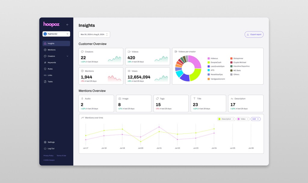
Insights you can act on in seconds
The Insights dashboard surfaces a brand's creator and mention health at a glance. How many creators are producing content, how many mentions came through, the breakdown of mention types and a time-series chart showing the trend over whatever period the user selects.
All the granular details are available for anyone who wants to drill in and explore the data. But the answer to the most common question, "is this campaign actually working?", lives above the fold where a brand manager can find it in under three seconds. That hierarchy was a deliberate design choice, not an accident of layout.
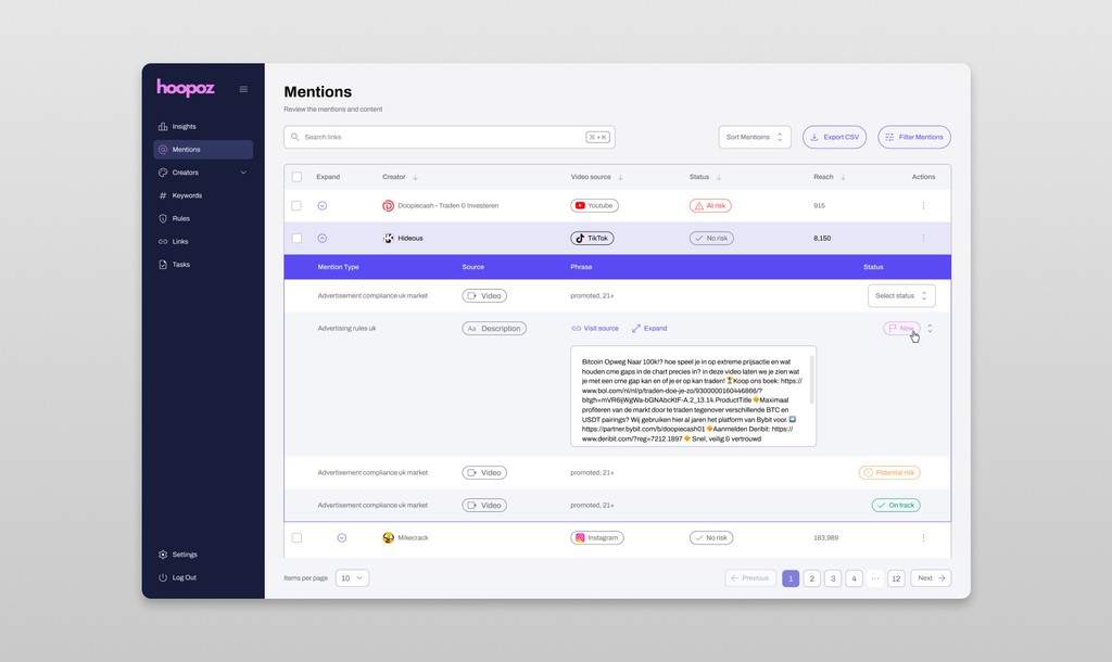
Sentiment, search, and compliance — same language
I redesigned the sentiment analysis and search result views alongside the main dashboard so they all inherit the same typographic scale, spacing rhythm and navigation patterns. When everything looks and behaves the same way, brand teams stop having to re-learn the product every time they switch between features. They just start using it.
Compliance monitoring got the same treatment. Ad compliance alerts, content flagging and regulatory checks all follow the same card patterns and interaction models as the rest of the platform. Consistency is not glamorous design work, but it is the kind of work that makes a product genuinely easier to use every single day.
A cleaner, more usable Hoopoz
The redesigned surfaces covering the dashboard, search, sentiment analysis and compliance views were handed off to the Hoopoz internal team, who took over development for the production build. The goal was never to produce pixel-perfect mockups that looked great in a portfolio. It was to give the engineering team a clear product direction and a design system that could scale with whatever features came next.
The project reinforced something I believe strongly: sometimes the most impactful design work is not adding new features but making existing features feel like they belong together. A product that feels coherent earns trust faster than a product that has more capabilities but makes users work harder to find them.